Learning how to cross stitch alphabet letters is mostly a counting problem. Once you know what fabric to use, where the centre sits, how tall the letters should be, and how much space to leave between words, the stitching itself is straightforward.
Most stitchers learn on Aida because the holes form a visible grid. Each square can hold one full cross stitch, and backstitch letters can travel along the same grid lines. Evenweave and linen work the same way once you adjust for the count, and waste canvas lets you transfer the same alphabet charts onto T-shirts, towels and finished items. This guide walks through both filled letters and backstitch lettering, with sizing advice that applies whether you are stitching a single name, a date, a quote or a full A-Z sampler.
On this page
- Start with the right kind of lettering
- Choose your fabric
- How fabric count changes letter size
- Plan the words before you stitch
- How to centre letters on the fabric
- Full cross stitch letters, step by step
- Backstitch letters, step by step
- Spacing letters and words
- Choosing thread, colour and fabric
- Using a text generator to make the chart
- Adding letters to an existing pattern
- Stitching a full alphabet sampler
- Common lettering mistakes
- Final checklist before you stitch
Start with the right kind of lettering
There are two common ways to stitch alphabet letters in cross stitch.
Filled cross stitch letters are built from full X-shaped stitches. They look bold and readable, especially for names, hoop quotes, children’s room pieces and anything that needs to be seen from a distance. A filled capital letter might be 10, 20, 40 or even 60 stitches high depending on the project.
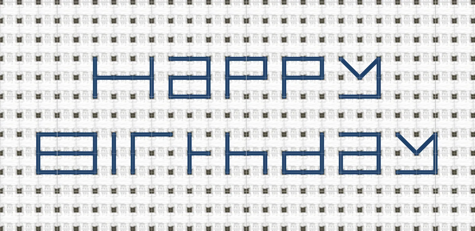
Backstitch letters are drawn with straight line stitches between the holes of the fabric. They look finer and more traditional, especially for dates, signatures, sampler alphabets and small labels. They also take up less space than filled letters, which matters when you are adding text to a design that is already crowded.
Neither method is better in every situation. A birth announcement with the baby’s name as the main feature usually wants filled letters. A date under a floral motif usually wants backstitch. A sampler may use both: bold full cross stitches for the alphabet, then tiny backstitched initials and year near the bottom.
If you are unsure, open the cross stitch fonts gallery and compare a filled font with a backstitch alphabet at the same wording. Seeing the difference on a grid makes the choice much easier.
Choose your fabric
The same alphabet chart works on a range of fabrics. The difference is mostly count, weave and what the finished piece will be used for.
Aida is the standard for lettering. The holes form a clear grid, every stitch sits in an obvious square, and counts of 11, 14, 16 and 18 cover most projects. For a first alphabet sampler or a name on a hoop, this is what we would recommend.
Evenweave (Lugana, Murano, Brittney) and linen (Belfast, Cashel) are the traditional sampler fabrics. They are usually stitched over two threads, which doubles the effective count - 28-count evenweave over two reads as 14-count. Letters look slightly softer because the holes are less defined, but the same chart spacing works.
Waste canvas is a temporary grid you tack onto a non-evenweave fabric - a T-shirt, a towel, a baby blanket - to stitch through, then pull out thread by thread once the lettering is done. It lets the same alphabet chart land on items that have no grid of their own.
Pre-finished items with Aida bands (table runners, bibs, bookmarks, towels) are essentially Aida sewn into a project. The lettering technique is identical.
Plastic canvas and perforated paper work the same way for small ornaments, cards and bookmarks, though backstitch lettering can be slightly stiff on paper.
For beginners, 14-count Aida is the safest default. It is large enough to see comfortably, widely available, and gives neat letter sizes without making projects enormous.
How fabric count changes letter size
Fabric count tells you how many stitch squares fit into one inch. The higher the count, the smaller each stitch becomes. Evenweave and linen are usually stitched over two threads, so their effective count is half the printed count.
For lettering, that means the same chart changes size depending on the fabric:
| Letter height on chart | 11-ct Aida | 14-ct Aida | 16-ct Aida | 18-ct Aida | 25-ct evenweave (over 2) | 28-ct evenweave (over 2) | 32-ct linen (over 2) |
|---|---|---|---|---|---|---|---|
| 14 stitches | 1.27 in | 1 in | 0.88 in | 0.78 in | 1.12 in | 1 in | 0.88 in |
| 28 stitches | 2.55 in | 2 in | 1.75 in | 1.56 in | 2.24 in | 2 in | 1.75 in |
| 42 stitches | 3.82 in | 3 in | 2.63 in | 2.33 in | 3.36 in | 3 in | 2.63 in |
Aida cloth is made for counted embroidery, with visible holes that form a regular grid. If you want a neutral reference on the fabric itself, the Aida cloth overview on Wikipedia explains how counts such as 11, 14, 16 and 18 relate to the number of squares per inch.
Eleven-count Aida is easier on the eyes but can make filled letters look chunky. Sixteen-count and 18-count Aida, and 32-count linen over two, are tidy for smaller work, but backstitch details need more care. Evenweave and linen sit between Aida counts, which is useful for sampler-style alphabets where the lettering needs to feel slightly softer than blocky Aida.
Before cutting fabric, check the full design size in the fabric calculator. Add at least 2 to 3 inches of margin on every side for framing, hooping or finishing.
Plan the words before you stitch
Do not start with the first letter unless the text is deliberately left-aligned. Most cross stitch lettering problems happen because the stitcher begins neatly, then discovers the final word does not fit.
Write down four things first:
- The exact words, including punctuation.
- The maximum width and height you can use.
- Whether the lettering should be centred, left-aligned or wrapped onto multiple lines.
- Whether the letters will be full cross stitch, backstitch or a mixture.
Short text can often sit on one line. Names, dates and initials are simple. Longer quotes need line breaks. Try to break lines where someone would naturally pause, not wherever the chart happens to run out of space.
For example, this reads naturally:
Home is where
the stitching is
This is technically centred but awkward:
Home is where the
stitching is
If your wording is more than one line, plan the longest line first. The longest line sets the width. Then you can centre the shorter lines under it.
How to centre letters on the fabric
To centre lettering, you need the centre of the fabric and the centre of the chart.
Fold the fabric gently in half vertically and horizontally, or mark the centre with a removable thread. Do not press a hard crease into dark or delicate fabric. On the chart, count the full width and height of the lettering block, including spaces between letters and words.
If the lettering block is 84 stitches wide, the centre sits 42 stitches from the left edge. If it is 85 stitches wide, the centre falls through the middle stitch. Both are workable, but odd numbers are often easier for single words because one central stitch can sit on the fabric centre line.
For a name or phrase:
- Count the total chart width.
- Divide by two.
- From the centre of the fabric, count left by that amount.
- Start stitching at the left edge of the text block, or start from a known central letter if the chart is easier that way.
For multi-line text, centre the whole text block vertically as well as horizontally. Count the full height from the top of the first line to the bottom of the last line, including line spacing. If you only centre the first line, the finished piece can sit too high.
For most generated charts, the edge of the text block is obvious on screen. The useful habit is simply to check the top-left corner of the lettering block before you start, then count from the fabric centre to that point so the first stitch lands in the right place.
Full cross stitch letters, step by step
Full cross stitch letters are stitched exactly like any other filled shape on the grid. Each filled square on the chart becomes one X on the fabric.
- Start with the first letter or with a central letter, depending on how you have counted the placement.
- Work one row at a time if the letter is blocky, or one colour area at a time if the font has curves.
- Keep the bottom half of every stitch slanting the same way.
- Complete the top half in the opposite direction.
- Check the outline after each letter before moving on.
Consistency matters more than speed. If most of your stitches have the top arm slanting from bottom left to top right, keep that direction for every letter. Mixed stitch direction catches the light differently and can make lettering look patchy.
For block capitals, it is often quickest to stitch a row of half stitches across the letter, then return along the same row to complete the Xs. For curved or script-style letters, smaller sections may be cleaner because there are fewer long thread carries on the back.
Avoid carrying thread across big empty spaces between letters. A dark thread carried behind pale fabric can show through, especially if the fabric is fine or the thread is bold. Finish the thread and restart at the next letter when the gap is more than a few stitches.
 Full cross stitch script letters need enough size and spacing for the curves to stay readable.
Backstitch letters, step by step
Backstitch letters are made from straight lines rather than Xs. On Aida, evenweave or linen, each line usually runs from one hole to another, along a grid line or diagonal.
A basic backstitch sequence looks like this:
- Bring the needle up one stitch length ahead of where the line begins.
- Take the needle down at the start point, making a stitch backwards.
- Bring the needle up one stitch length ahead again.
- Take the needle down in the same hole where the previous stitch came up.
- Repeat along the line.
This gives a neat continuous line on the front. On the back, the thread travels in a tidy sequence rather than jumping around the fabric.
For letters, follow the chart line by line. Straight verticals and horizontals are simple. Diagonals need care because they can cross either one square, two squares, or a longer slope depending on the font. If a diagonal looks too loose, split it into shorter backstitches.
Use one strand for delicate backstitch on 16-count or 18-count Aida. Use one or two strands on 14-count depending on how visible the lettering needs to be. Two strands is easier to read for names and labels. One strand is better for tiny dates, signatures and fine outlines.
If you want more detail on line alphabets, the backstitch alphabet guide covers when to choose backstitch instead of filled cross stitch.
 Backstitch lettering is useful when the words need to stay fine, small and readable.
Spacing letters and words
Letter spacing is not just empty fabric. It is part of the design.
For filled cross stitch letters, leave at least one blank stitch between letters unless the font is designed to connect. Narrow letters such as I and L may need more visual space than the chart suggests because they are thin. Wide letters such as M and W may need slightly less.
For backstitch letters, leave enough room for the line weight. Two backstitched letters that nearly touch on the chart may merge once stitched, especially if you use two strands. One full blank square between letters is a safe starting point for small alphabets.
Word spacing should be wider than letter spacing. For small backstitch text, two or three blank stitches between words is often enough. For filled text, word spacing may need to be the width of a narrow letter.
Line spacing matters too. If the descenders on one line, such as g, j, p, q or y, nearly touch the capitals below, the text will look cramped. Leave at least two blank rows between simple block-letter lines. Leave more for script fonts, backstitch alphabets with flourishes, or anything with lower-case descenders.
Test spacing by looking at the chart from arm’s length. If the words read as one lump, add space before stitching.
Choosing thread, colour and fabric
For most lettering on 14-count Aida or 28-count evenweave over two, two strands of stranded cotton is the normal starting point for full cross stitches. It gives good coverage without making the stitches bulky. On 16-count or 18-count Aida, or 32-count linen over two, two strands still works for many full cross stitch letters, though some stitchers prefer one strand for a lighter look.
Backstitch is different. One strand gives a fine line. Two strands gives a stronger outline. If the letters are part of the main design, use two strands. If they are a quiet date or signature, use one.
High contrast is your friend. Dark thread on pale Aida is easy to read. Pale thread on dark Aida can look lovely, but every small tension change shows. If you are stitching black or navy Aida, test the lettering first and use good lighting.
Avoid very similar colours for text and background unless the subtlety is deliberate. A pale pink name on cream Aida may look pretty in your hand and disappear once framed on a wall.
If you need to match a specific thread shade, use the DMC colour chart to compare families before choosing. For gifts, write the colour number on your working copy so you can repair or extend the design later.
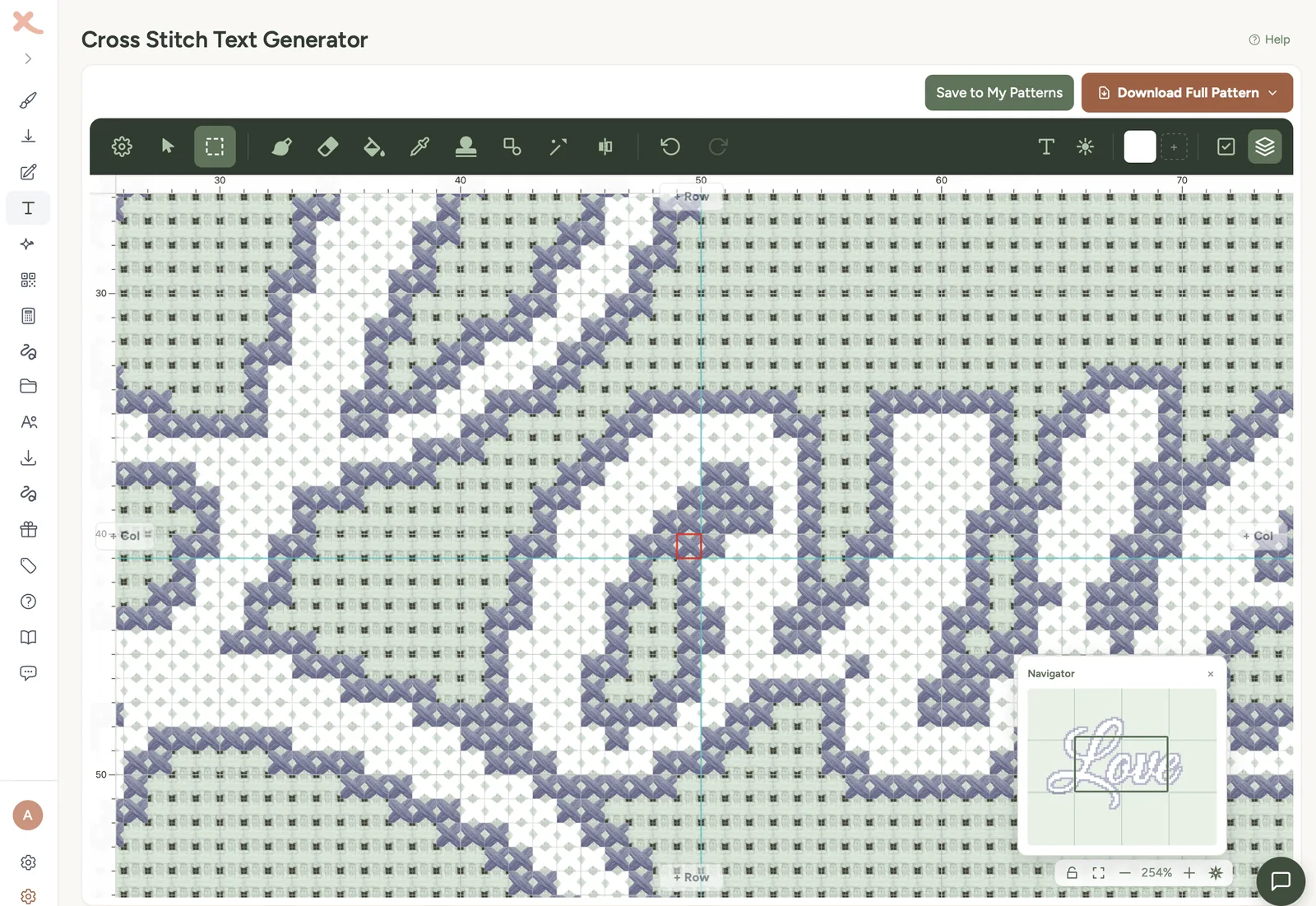
Using a text generator to make the chart
You can chart letters by hand on graph paper, but a tool is faster when you need accurate centring, consistent spacing or a printable PDF.
The cross stitch text generator lets you type the words, choose a font, adjust size and spacing, then open the result as a stitchable chart. It is useful for names, quotes, labels, dates and simple sampler bands.
A good workflow is:
- Type the exact wording.
- Try two or three fonts from the fonts gallery.
- Set the fabric count and check the finished size.
- Adjust letter spacing before generating the final pattern.
- Open the pattern in the editor for any last layout changes.
- Download the PDF when the chart is ready.
For beginners, start with a clear block, serif or simple backstitch font. Save ornate script for larger pieces. Cursive letters need more space to stay readable, and tiny curves can become awkward on coarse fabric.
If you are making initials rather than full words, the cross stitch monogram patterns guide has more specific advice on single letters, pairs and traditional three-letter layouts.
Adding letters to an existing pattern
Adding words to an existing cross stitch pattern is a little different from designing a text-only chart. The lettering has to fit around the image, border and empty space already in the design.
First, decide where the text belongs. Names often sit below the motif. Dates can sit in a corner. Labels and short phrases can be worked into a border. If the design is symmetrical, keep the lettering centred unless there is a clear reason not to.
Next, count the available stitch area. Do not guess from the fabric. Count the grid squares in the pattern space where the words will sit. If you have 70 stitches available and the text chart is 78 stitches wide, shrinking the font or switching to backstitch is safer than squeezing the letters.
For photo-based projects, generate the image pattern first, then add the words afterwards. The photo converter is best for turning the image into a chart; the text should usually be added as a separate, cleaner lettering layer rather than left inside the photo. Photo-converted text often comes out jagged because the converter is trying to match pixels, not design readable letters.
If you need a blank area for wording, open the chart in the pattern designer and reserve that space before you add borders or motifs. Lettering reads best when it has breathing room.
Stitching a full alphabet sampler
Stitching a complete A-Z, rather than a single name or quote, is one of the oldest cross stitch projects there is. Victorian schoolgirls used alphabet samplers to practise lettering, mark linens and learn needle skills. Today, an alphabet sampler is still one of the best ways to learn a new font properly, because by the time you have stitched all 26 letters you will know every quirk in the chart.
A few decisions shape the project:
Capitals only, lower case only, or both. Capitals are easier to start with - they sit on a single baseline with no descenders. Both cases together give you a more useful chart for future names and quotes, at the cost of more rows and more planning.
One row, two rows, or three. Twenty-six letters in one row is wide. For most hoops and frames, the alphabet sits more comfortably in two rows (A-M and N-Z) or three rows of roughly nine letters. Plan the row break before you start so the longest row sets the chart width.
Numbers and punctuation. Most alphabet samplers add 0-9 below the letters, and often an ampersand, full stop and comma. If you plan to reuse the chart for names and dates later, include them - they cost very little extra time and make the chart genuinely reusable.
Spacing within and between rows. Leave at least two blank rows between rows of capitals, more if the font has descenders or lower-case below. One blank stitch between letters is the minimum for filled fonts; backstitch alphabets can sit closer.
Style decisions for the whole alphabet. A single colour is the traditional sampler choice and stays readable. Two alternating colours (one per letter, or one per row) adds rhythm without making the alphabet busy. Multi-coloured alphabets where every letter is a different shade are eye-catching but lose readability as a reference.
A practical sizing guide. A 9-stitch-tall block alphabet, capitals only in two rows of 13, fits a 6 inch hoop on 14-count Aida with room for a small border. A 14-stitch-tall serif alphabet with capitals and lowercase fills roughly an 8 inch hoop. A full sampler with alphabet, numbers, year and stitcher’s initials traditionally sits on a 10 to 12 inch piece of fabric.
If you want a one-click starting point, the text generator will lay out a full A-Z in any of the available fonts and let you export it as a chart. From there, you can save it to your library and reuse it for every name and date you stitch afterwards.
Common lettering mistakes
Starting without counting the full width. This is how names drift off centre. Count the full text block first, including spaces.
Using letters that are too small. A four-stitch-high filled alphabet rarely reads well on 14-count Aida or 28-count evenweave. If the wording matters, give it space or use backstitch.
Choosing a script font for tiny text. Script needs curves, joins and breathing room. At small sizes, choose a simple alphabet instead.
Crowding the border. Leave blank fabric between letters and borders. A name squeezed into a frame looks like an afterthought.
Carrying dark thread behind pale fabric. Long carries can shadow through the fabric. Finish the thread and restart when the gap is wide.
Mixing stitch direction. Keep the top arm of every cross stitch going the same way. Lettering shows inconsistent direction quickly because the shapes are clean and regular.
Skipping the test stitch. Stitch one letter on scrap fabric if the final project matters. It tells you whether the thread weight, colour and size are right before you commit to the whole name.
Final checklist before you stitch
Before you thread the needle, check these five things:
- The wording is final, including punctuation and dates.
- The full text block fits the available stitch area.
- The centre of the text block matches the centre of the fabric or the design space.
- The font is readable at the chosen fabric count.
- The thread colour has enough contrast against the fabric.
Lettering rewards patience. Count first, stitch second, and check the spacing before you are three words in. If you want the quickest route, use the text generator to convert text to cross stitch, then use the fabric calculator to confirm the finished size on your chosen fabric. Once those two numbers agree, the actual stitching is the easy part.